Tera
Achieving early market traction with a health-focused shopping assistant app.
OVERVIEW
Tera is a startup dedicated to simplifying healthy and sustainable everyday shopping. I joined as the first designer in 2020 when the initial website, an online store promoting third-party sustainable brands, was already live. Over the next few months, we tried various solutions with curating sustainable brands without gaining significant traction.
Recognizing the widespread greenwashing and lack of consumer trust in sustainability claims, we shifted our focus. Through discussions with our target audience, US millennials, we moved from curation towards transparency and personalization, empowering users to make informed choices for themselves. When we transitioned to a personalized app, the product began to show early traction.
OUTCOMES
50% sign ups (% of users who complete onboarding)
6% conversion rate (% of users who make a purchase)
21% unique active users in the first 30 days
TESTIMONIAL
His ability to translate complex requirements into elegant design solutions was impressive. Beyond his exceptional design skills, he also made significant contributions on the strategic side, offering valuable insights that shaped our project’s direction and success.

CJ Martignetti
Head of Product Management, Tera
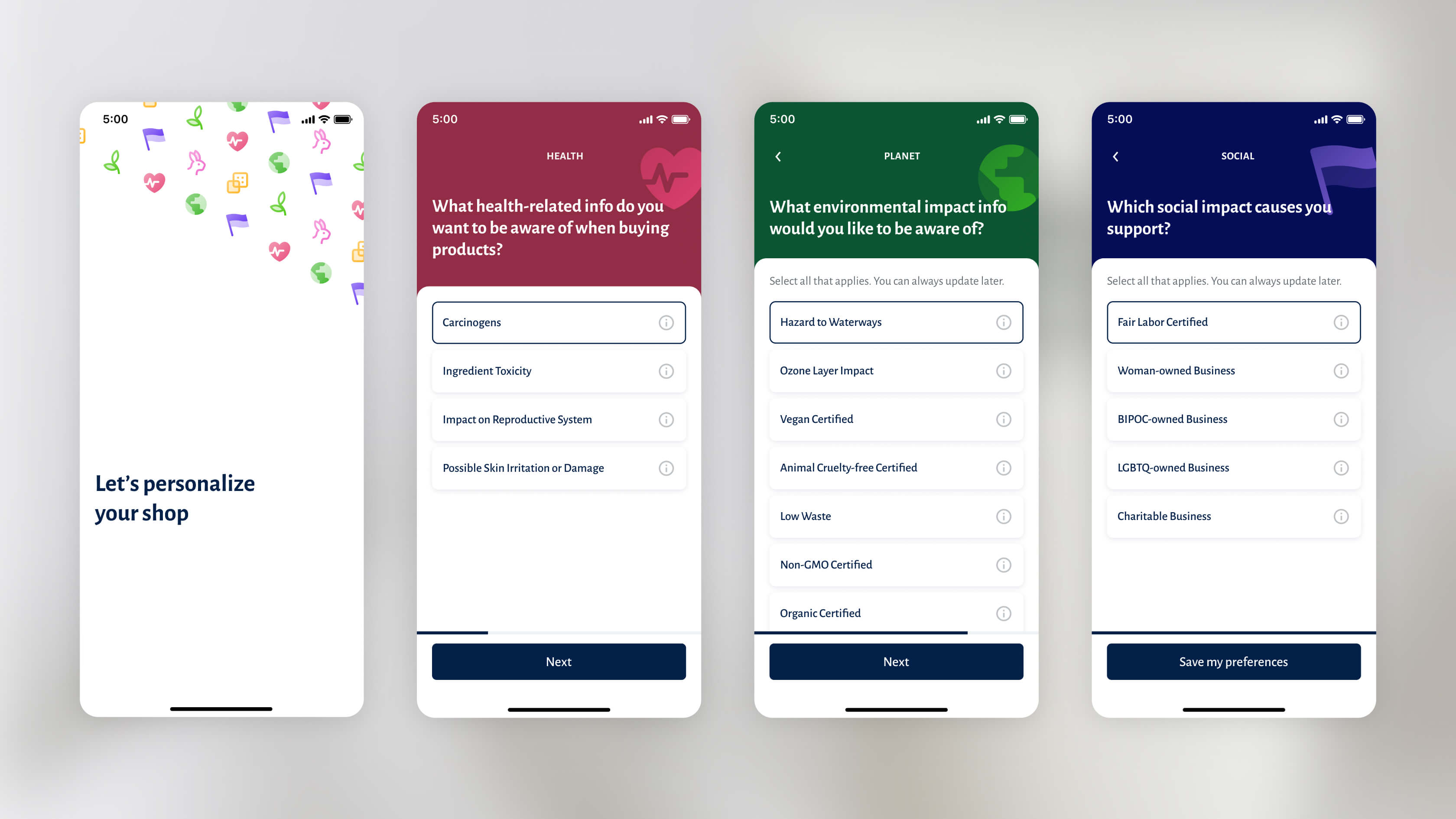
Empowering users through an easy onboarding
Individuals have multiple values and preferences with different levels of importance. By creating an onboarding that enables users to quickly set up their own preferences, we empower them with a sense of control and deeper connection to the app. This approach not only enhances user engagement but also boosts retention.
Personal shopping assistant
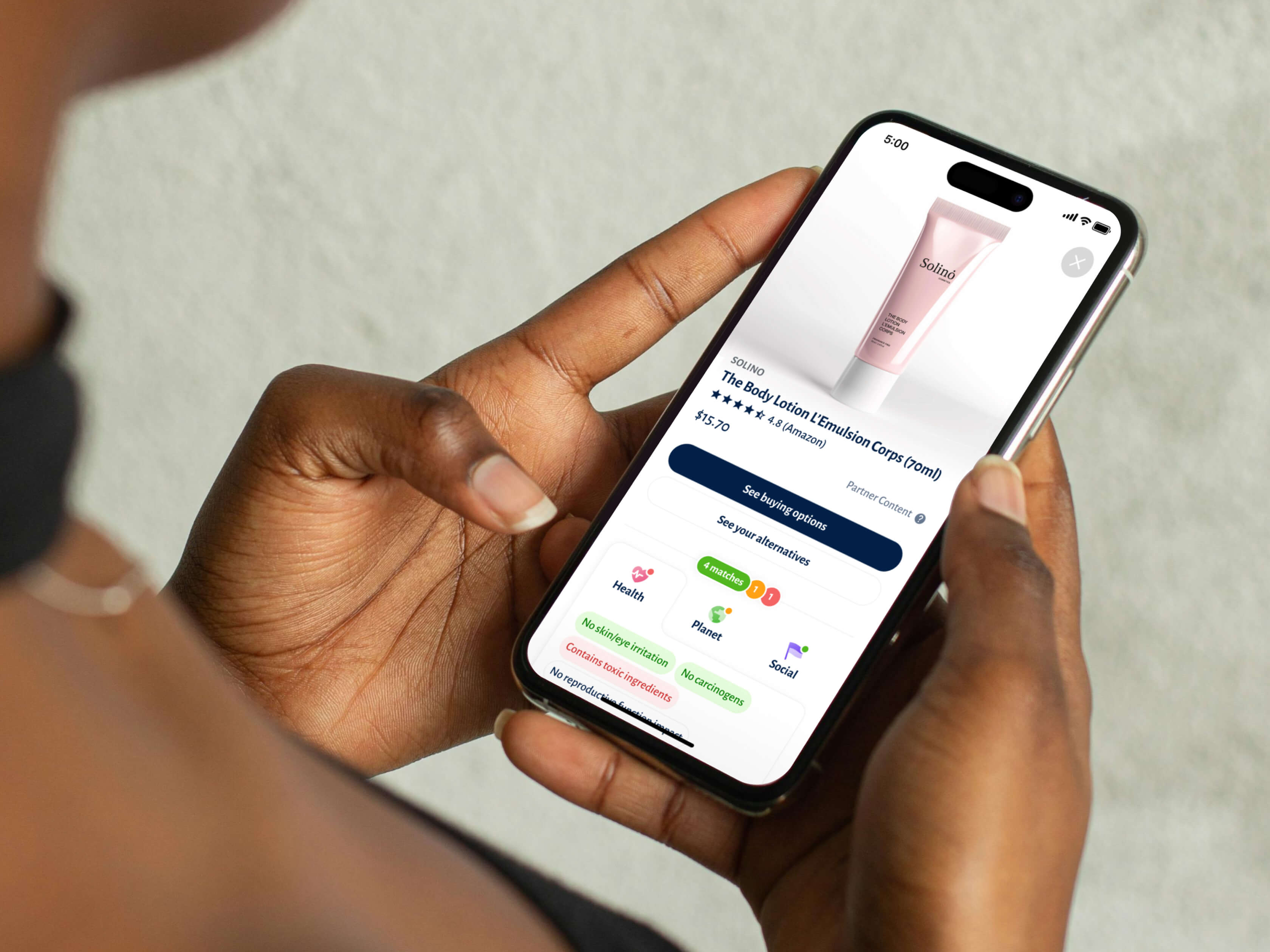
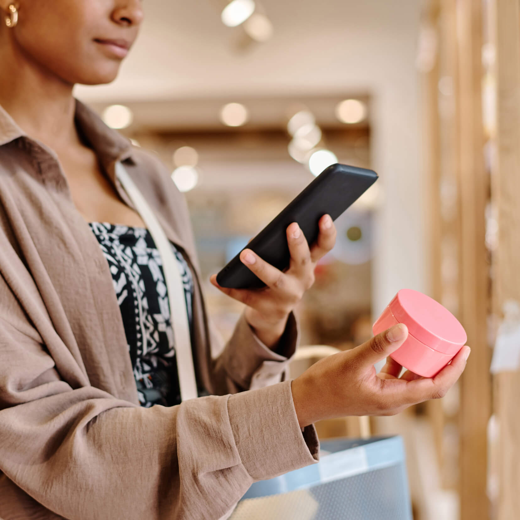
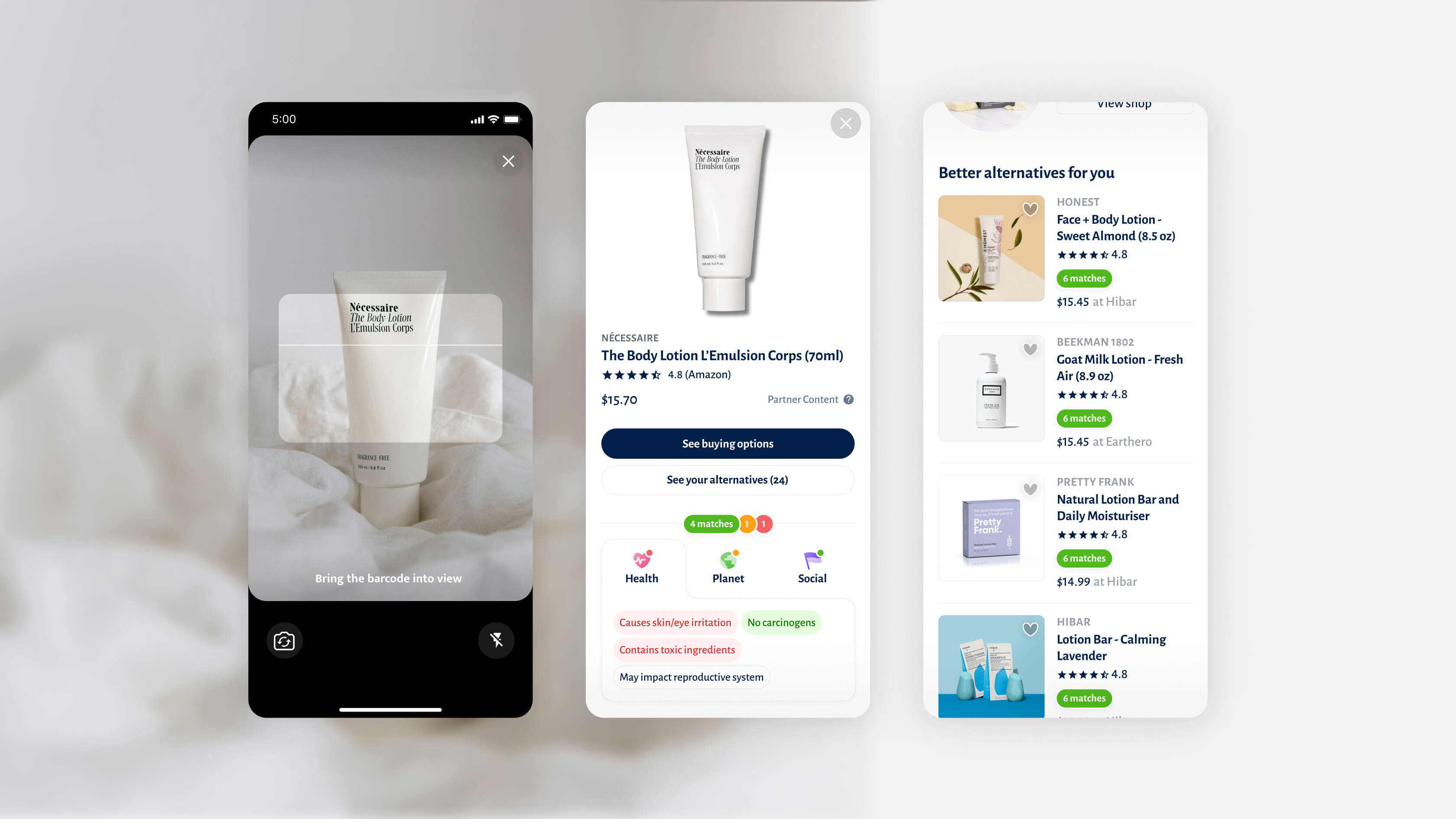
The key moment happens when users compare a product to their personal preferences. The “product scorecard” is prominently displayed just below the CTA button on the product details page, allowing users to quickly see if the product meets their criteria. If the product doesn’t match their preferences, the app suggests better alternatives. Additionally, the scanner feature lets users use the app in a real store to check products on the spot.
Building trust through transparency
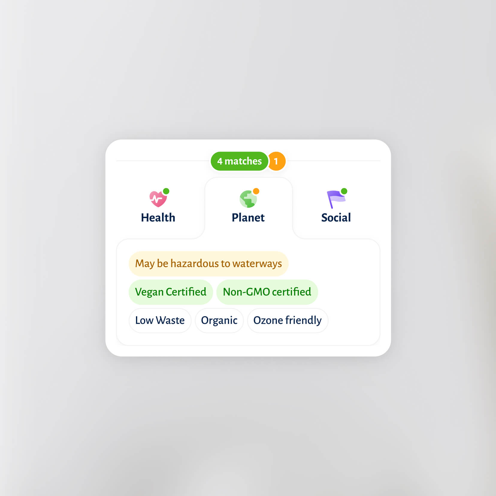
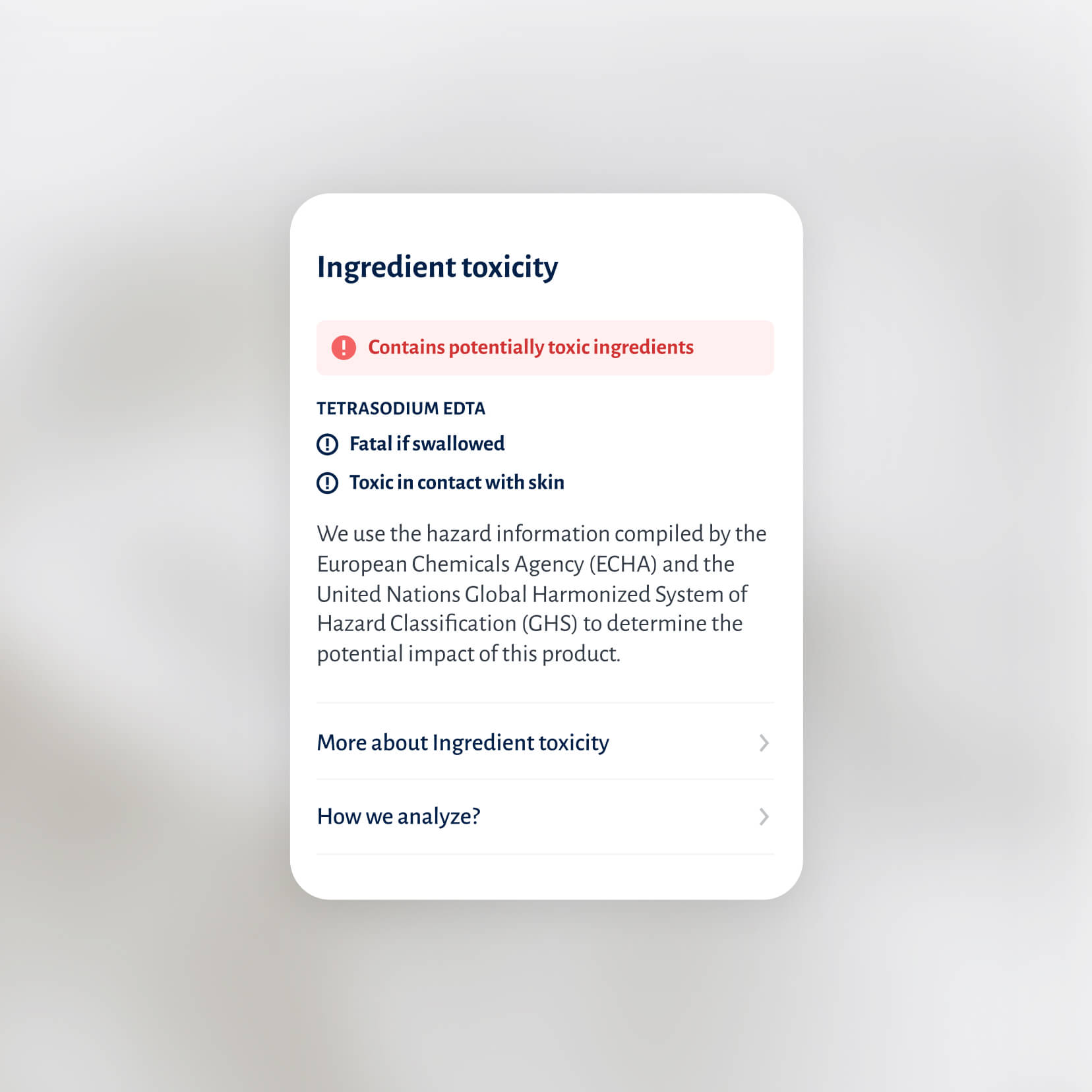
Color coding, icons, and concise copywriting make the scorecard easy to understand at a glance. Detailed information is just a tap away, offering in-depth insights into each attribute and clearly revealing the relevant sources, which builds trust in the experience.
Optimized for conversion
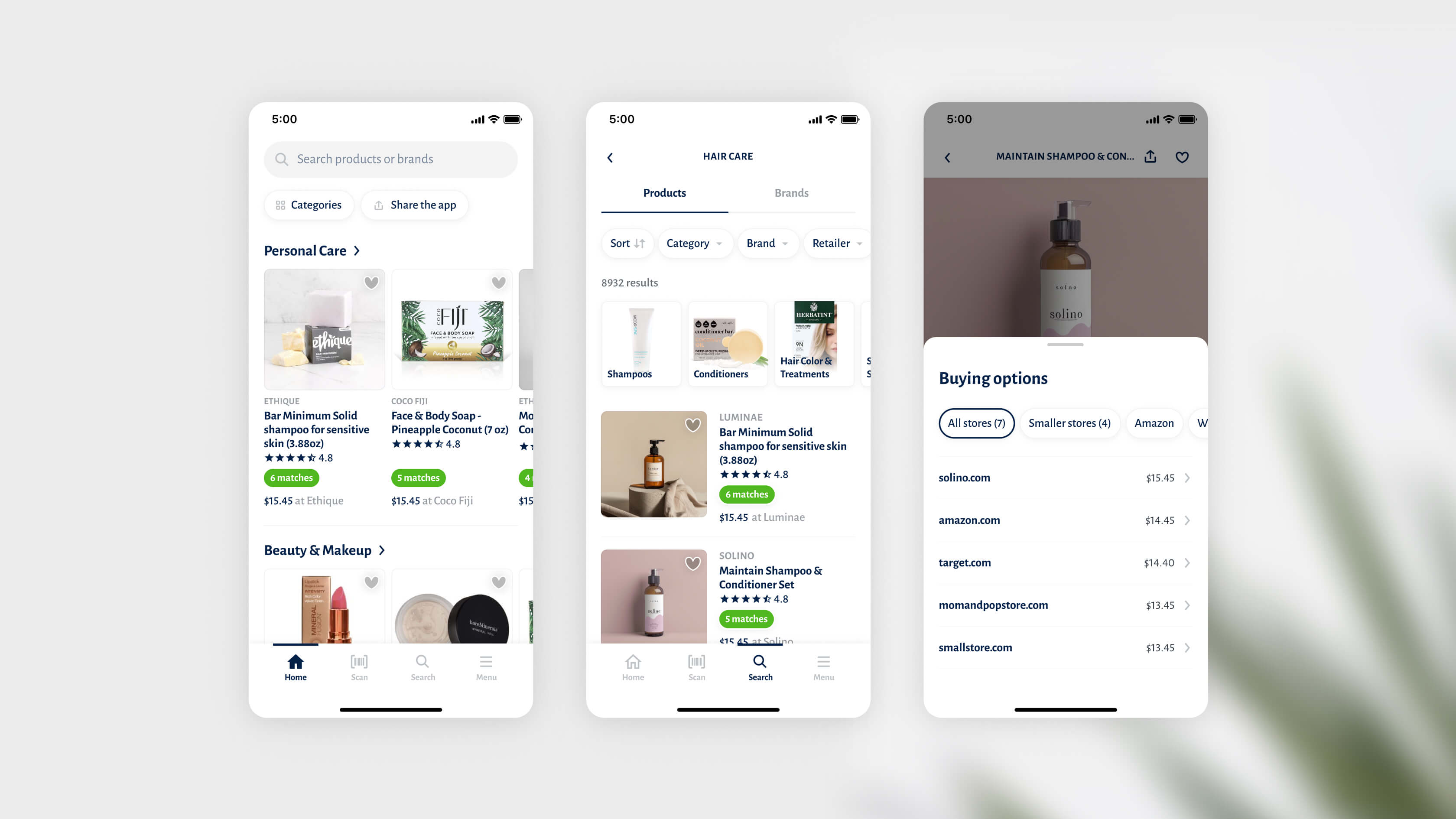
The shopping experience is designed for quick item comparison, featuring the flexibility and functions of a typical e-commerce app, allowing users to buy from their preferred retailers. The app prioritizes and highlights “matching” products first, ensuring the best options for the user are front and center.
TESTIMONIAL
Mateo is very good at managing input from various stakeholders, and corralling people towards decision making, he works fast and is a great communicator. I would recommend him to anyone who wants to develop a world class app.

Bernard Louvat
CEO & FOunder, Tera
Designed in close collaboration with CEO and Founder, Head of Product Management, Product Manager, and Engineering Lead.
NEXT PROJECT
